PortlandWiki:GUI CA: Difference between revisions
(Created page with "==Competitive Assessment== Part of thinking about a new design is to see if we can look at other wikis out there. To see how other sites have evolved, and to deduce why they rea...") |
(Wikifashion is not affiliated with Wikia (as per an email from Wikifashion rep)) |
||
| Line 45: | Line 45: | ||
| | | | ||
[http://wikifashion.com/wiki/Main_Page '''WikiFashion | [http://wikifashion.com/wiki/Main_Page '''WikiFashion'''] | ||
A part from looking like a consumer clothing retailer, Wikifashion is very very nice. Spacious and appealing. Though the layout is a bit complicated, I like the over all tone of the wiki. It uses subtle colors that make it feel warm and inviting. | A part from looking like a consumer clothing retailer, Wikifashion is very very nice. Spacious and appealing. Though the layout is a bit complicated, I like the over all tone of the wiki. It uses subtle colors that make it feel warm and inviting. | ||
Latest revision as of 21:54, 24 August 2011
Competitive Assessment
Part of thinking about a new design is to see if we can look at other wikis out there. To see how other sites have evolved, and to deduce why they reached to that conclusion. Unless someone among us were part of the design, I can only analyze based on the conclusion. Sometimes this is called heuristics. We methodically look at other sites with similar purposes or similar technologies. We methodically note what we like.
| Site | Screenshot |
|---|---|
| WikiHow
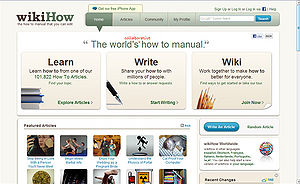
Wikihow is a question and answers style Wiki. This wiki does a pretty good job feeling warm and friendly and yet still reserved enough to not feel bloggy
|
 |
|
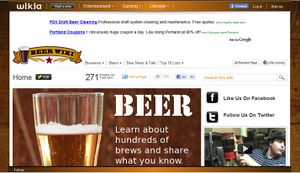
This is a fun colorful wiki. Though it follows the Wikia template, which means the top navigation is actually a meta navigation between other wikis.
|
|
|
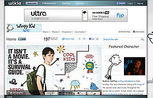
This is a fun colorful wiki. Though it follows the Wikia template, which means the top navigation is actually a meta navigation between other wikis.
|
|
|
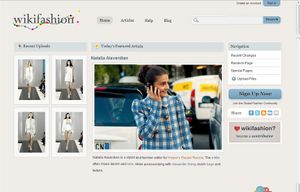
A part from looking like a consumer clothing retailer, Wikifashion is very very nice. Spacious and appealing. Though the layout is a bit complicated, I like the over all tone of the wiki. It uses subtle colors that make it feel warm and inviting.
|
|
|
From what I've deduced about Wetpaint's history. I think their goal was to show the range of what the Wetpaint Wiki Platform can do. To that end, they've sort of pushed the templates aggressively. Though interesting, it doesn't say 'wiki' or 'knowledge' to me. That could simply be the content they happen to be showing.
|

|
|
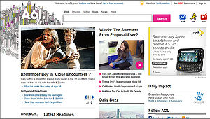
I worked on the AOL portal when I was in New York City. I was fairly impressed by the size of their editorial team. About 15 full-time editors, and 20 or so full-time writers and a billion freelancers. They have a HUGE team which can provide daily content, and a team of graphic designers whose soul purpose is to create splashy graphics. For the record, I have no illusions about trying to mimic their exhaustive speed. However, there are some consistent area I think we can learn from
|
|
|
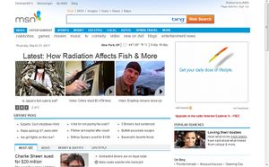
I can only assume their editorial team is massive. This is a big factor in our design. With enough relevant pictures and content, the nav doesn't have to do much work. Layout can be more basic. MSN is king of the link-farm type design. Links and links and links. They have relevant updated photos, so they can get away with that. They assume people are photo-clickers, not page-readers.
|
|
|
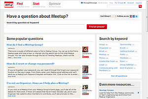
Besides not being a wiki, this site is gorgeous. I think it's a valid design reference because they, like us, have a lot of text, and spartan photos. They are able to create a design that is intelligent and welcoming.
|
|