PortlandWiki:GUI
PortlandWiki needs a new user interface! Help us build it. This page is a central dumping ground for ideas, wireframes, graphics, color schemes, and anything else related to improving our "look-and-feel"!
Competitive Assessment
Part of thinking about a new design is to see if we can look at other wikis out there. To see how other sites have evolved, and to deduce why they reached to that conclusion. Unless someone among us were part of the design, I can only analyze based on the conclusion. Sometimes this is called heuristics. We methodically look at other sites with similar purposes or similar technologies. We methodically note what we like.
| Site | Screenshot |
|---|---|
| WikiHow
Wikihow is a question and answers style Wiki. This wiki does a pretty good job feeling warm and friendly and yet still reserved enough to not feel bloggy
|
 |
|
Beer Wiki (Wikia) This is a fun colorful wiki. Though it follows the Wikia template, which means the top navigation is actually a meta navigation between other wikis.
|

|
|
Diary of a Wimpy Kid(Wikia) This is a fun colorful wiki. Though it follows the Wikia template, which means the top navigation is actually a meta navigation between other wikis.
|

|
|
Fashion Wiki(Wikia) A part from looking like a consumer clothing retailer, Wikifashion is very very nice. Spacious and appealing. Though the layout is a bit complicated, I like the over all tone of the wiki. It uses subtle colors that make it feel warm and inviting.
|

|
|
Wetpaint Likes, dislikes? Comments?
|

|
|
AOL Portal Likes, dislikes? Comments?
|

|
|
MSN Likes, dislikes? Comments?
|

|
|
Meetup.com Likes, dislikes? Comments?
|

|
Sometimes called the 'wrapper' it is the part of the site that presents brand and top level navigation as well as development related tasks and actions. The current 2010 design has fairly large amount of screen real estate devoted to top navigation.


Piki (portlandwiki) has a layout similar to Wikipedia and countless other wikis that use Wikimedia's software. That's not to say that this is a good or necessarily bad. It is important to think about priorities. What we see in the red below, is also the most important part of the screen. And what do we fill it with? Besides the main and events, we have publishing and editing related items.
By placing these items in the most valuable area, we are saying that publishing knowledge is more important than gaining knowledge. I contend the opposite. That the gaining and use of the knowledge is the most important. It is the learners and readers I think the UI has to cater more to.
The creators (or writers) are 'power' participants. Visit a lot, and they have an understanding of how wiki's work. Some of them even know how to code html. I don't have to worry about them. What ever limitation exists for the UI, they will over come them.
There are a couple items in the wrapper that deserve attention.
- the logo
- the search
- account related links
The tricky part will be to highlight these areas while streamlining the other areas of the cwrapper
With this particular design all the c-wrap elements have been put at the top, items that are in the side nav now could be in a pull-down (not shown)

-
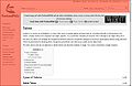
Screenshot of page. Red highlights the current cwrap
-
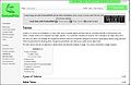
Screenshot of a standard page, Green highlights the key elements. Logo, Search, Account info
-
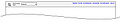
New wireframe for the top part of the cwrap
-

Design for the top part of the cwrap
-
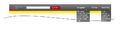
Add three drop downs for main content and tools.