PortlandWiki:GUI Design Concepts
PortlandWiki needs a new user interface! Help us build it. This page is a central dumping ground for ideas, wireframes, graphics, color schemes, and anything else related to improving our "look-and-feel"!
The C-Wrap
Sometimes called the 'wrapper' it is the part of the site that presents brand and top level navigation as well as development related tasks and actions. The current 2010 design has fairly large amount of screen real estate devoted to top navigation.
Piki has a layout similar to Wikipedia and countless other wikis that use Wikimedia's software. That's not to say that this is a good or necessarily bad. It is important to think about priorities. What we see in the red below, is also the most important part of the screen. And what do we fill it with? Besides the main and events, we have publishing and editing related items.
-
Screenshot of page. Red highlights the current cwrap
-
Screenshot of a standard page, Green highlights the key elements. Logo, Search, Account info
-
Mind map of page elements
By placing these items in the most valuable area, we are saying that publishing knowledge is more important than gaining knowledge. I contend the opposite. That the gaining and use of the knowledge is the most important. It is the learners and readers I think the UI has to cater more to.
The tricky part will be to highlight these areas while streamlining the other areas of the cwrapper
Home Design
Home page has a different behavior and look from the inside top nav. In this case we are bringing the search front and center. News will appear, in a fashion that is submissive. Some might contend that the purpose of the Piki's home is to browse Portland events, though I contend that it is for searching. Either way it's good to have a hybrid.
Primary Search Box Design
-
the ubiquitous Google home
-
Wolfram Alpha uses search as primary element
-
Bing's primary search element
The creators (or writers) are 'power' participants. Visit a lot, and they have an understanding of how wiki's work. Some of them even know how to code html. I don't have to worry about them. What ever limitation exists for the UI, they will over come them.
There are a couple items in the wrapper that deserve attention.
- the logo
- the search
- account related links
Wireframes
-
wireframe #1 using a thin search bar
-
Wireframe #2 featuring independent search bar
-
mind map of the top nav
Wireframe for the concept of simplifying the top nav. Again we're talking about bringing the content of the page UP and OUT, like some of the competitors we see. We don't want users dwelling on the top nav. People aren't thrilled by navigation topics, they are thrilled to see content that matches their expectations.
Visual Design "Dark Rose"
-
Comp #1
-
Comp #2
One visual design for the top nav. Doing one so soon is a bit hasty, but it's important to get the idea out that the top nav is there as a simple preface, i want the content to pop. That's why its dark.
Why red? Because the logo is red. The concept is they see the rose, and then their eye hops over to the search button.
Why dark grey? To make the top nav blend into the browser. I want the content below to pop. That means the content has got to do that. Pasting the existing layout of the content won't work. We need new things like variability and margins.
Layout Structure

Between the header and the footer, lies the content. The real part of the wiki. It is in this area where we will create the perfect Petri dish for content of all kinds. From literary format, to magazine, to news. In time perhaps we will be able to integrate more dynamic forms such as rss, delicious, digg, facebook, twitter.
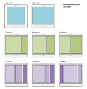
We start by reviewing all the different characteristics that is available to us. The first axis is vertical. Vertical columns give us a basis for creating a combination of content components. Fortunately there are only a few types column layouts.
Sample Home Layouts using Image Widgets Only
-
Layout #1
-
Layout #2
-
Layout #3
These layouts depend on each article containing a photo that can be accessed as well as a title and excerpt text. none of this is standard for a wiki, so either we figure out how to automatically scrape a title, photo, and excerpt from an article.
Piki is text heavy, there will never be enough photos to support an image heavy layout.
Searchbar Widget -- In the current design there is an opportunity to create a concise graphical TMA that can serve to highlight searches, meetups and contact info. One version can be seen on the PortlandWiki(Test1).
Though I'm hard pressed to get into the conversation about the footer, it tends to be addressed when discussing the header. There has been a lot of evolution lately about the footer element. Just what is in there now has grown.
It's always had boiler plate stuff like Policy, Contacts, Copyrights. There are also new items that have not been warranted in the footer. I think people have realized that there is still a large percent of people who arrive at the bottom of the page, who still haven't found the content they are looking for.
Patterns
-
Footer navigation of Dell Computers
-
Footer navigation for WikiFashion
-
Footer navigation for Valtera
The idea with these more complex footers is to act as a spring board to send a user to a better topic instead of requiring the to scroll back up to find something interesting.
Wireframes
-
Footer Idea #1 Wireframe
Visual Design "Dark Rose"
-
Footer Idea #2 Wireframe


