PortlandWiki:GUI
PortlandWiki needs a new user interface! Help us build it. This page is a central dumping ground for ideas, wireframes, graphics, color schemes, and anything else related to improving our "look-and-feel"!
Competitive Assessment
Part of thinking about a new design is to see if we can look at other wikis out there. To see how other sites have evolved, and to deduce why they reached to that conclusion. Unless someone among us were part of the design, I can only analyze based on the conclusion. Sometimes this is called heuristics. We methodically look at other sites with similar purposes or similar technologies. We methodically note what we like.
| Site | Screenshot |
|---|---|
| WikiHow
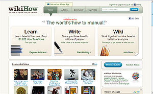
Wikihow is a question and answers style Wiki. This wiki does a pretty good job feeling warm and friendly and yet still reserved enough to not feel bloggy
|
 |
|
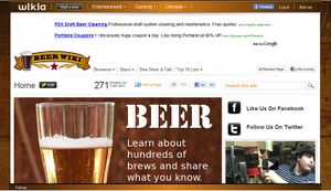
This is a fun colorful wiki. Though it follows the Wikia template, which means the top navigation is actually a meta navigation between other wikis.
|
|
|
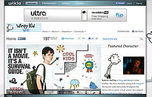
This is a fun colorful wiki. Though it follows the Wikia template, which means the top navigation is actually a meta navigation between other wikis.
|
|
|
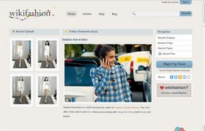
A part from looking like a consumer clothing retailer, Wikifashion is very very nice. Spacious and appealing. Though the layout is a bit complicated, I like the over all tone of the wiki. It uses subtle colors that make it feel warm and inviting.
|
|
|
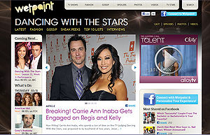
From what I've deduced about Wetpaint's history. I think their goal was to show the range of what the Wetpaint Wiki Platform can do. To that end, they've sort of pushed the templates aggressively. Though interesting, it doesn't say 'wiki' or 'knowledge' to me. That could simply be the content they happen to be showing.
|
|
|
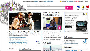
I worked on the AOL portal when I was in New York City. I was fairly impressed by the size of their editorial team. About 15 full-time editors, and 20 or so full-time writers and a billion freelancers. They have a HUGE team which can provide daily content, and a team of graphic designers whose soul purpose is to create splashy graphics. For the record, I have no illusions about trying to mimic their exhaustive speed. However, there are some consistent area I think we can learn from
|
|
|
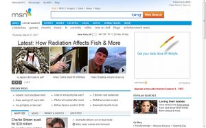
I can only assume their editorial team is massive. This is a big factor in our design. With enough relevant pictures and content, the nav doesn't have to do much work. Layout can be more basic. MSN is king of the link-farm type design. Links and links and links. They have relevant updated photos, so they can get away with that. They assume people are photo-clickers, not page-readers.
|
|
|
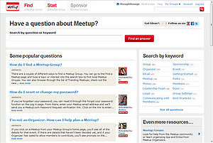
Besides not being a wiki, this site is gorgeous. I think it's a valid design reference because they, like us, have a lot of text, and spartan photos. They are able to create a design that is intelligent and welcoming.
|
|
The C-Wrap
Sometimes called the 'wrapper' it is the part of the site that presents brand and top level navigation as well as development related tasks and actions. The current 2010 design has fairly large amount of screen real estate devoted to top navigation.
Piki has a layout similar to Wikipedia and countless other wikis that use Wikimedia's software. That's not to say that this is a good or necessarily bad. It is important to think about priorities. What we see in the red below, is also the most important part of the screen. And what do we fill it with? Besides the main and events, we have publishing and editing related items.
-
Screenshot of page. Red highlights the current cwrap
-
Screenshot of a standard page, Green highlights the key elements. Logo, Search, Account info
-
Mind map of page elements
By placing these items in the most valuable area, we are saying that publishing knowledge is more important than gaining knowledge. I contend the opposite. That the gaining and use of the knowledge is the most important. It is the learners and readers I think the UI has to cater more to.
The tricky part will be to highlight these areas while streamlining the other areas of the cwrapper
Home Design
Home page has a different behavior and look from the inside top nav. In this case we are bringing the search front and center. News will appear, in a fashion that is submissive. Some might contend that the purpose of the Piki's home is to browse Portland events, though I contend that it is for searching. Either way it's good to have a hybrid.
Primary Search Box Design
-
the ubiquitous Google home
-
Wolfram Alpha uses search as primary element
-
Bing's primary search element
The creators (or writers) are 'power' participants. Visit a lot, and they have an understanding of how wiki's work. Some of them even know how to code html. I don't have to worry about them. What ever limitation exists for the UI, they will over come them.
There are a couple items in the wrapper that deserve attention.
- the logo
- the search
- account related links
Wireframes
-
wireframe #1 using a thin search bar
-
Wireframe #2 featuring independent search bar
-
mind map of the top nav
Wireframe for the concept of simplifying the top nav. Again we're talking about bringing the content of the page UP and OUT, like some of the competitors we see. We don't want users dwelling on the top nav. People aren't thrilled by navigation topics, they are thrilled to see content that matches their expectations.
Visual Design "Dark Rose"
-
Comp #1
-
Comp #2
One visual design for the top nav. Doing one so soon is a bit hasty, but it's important to get the idea out that the top nav is there as a simple preface, i want the content to pop. That's why its dark.
Why red? Because the logo is red. The concept is they see the rose, and then their eye hops over to the search button.
Why dark grey? To make the top nav blend into the browser. I want the content below to pop. That means the content has got to do that. Pasting the existing layout of the content won't work. We need new things like variability and margins.
Layout Structure
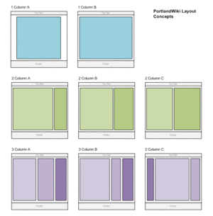
Between the header and the footer, lies the content. The real part of the wiki. It is in this area where we will create the perfect Petri dish for content of all kinds. From literary format, to magazine, to news. In time perhaps we will be able to integrate more dynamic forms such as rss, delicious, digg, facebook, twitter.
We start by reviewing all the different characteristics that is available to us. The first axis is vertical. Vertical columns give us a basis for creating a combination of content components. Fortunately there are only a few types column layouts.
Sample Home Layouts using Image Widgets Only
-
Layout #1
-
Layout #2
-
Layout #3
These layouts depend on each article containing a photo that can be accessed as well as a title and excerpt text. none of this is standard for a wiki, so either we figure out how to automatically scrape a title, photo, and excerpt from an article.
Piki is text heavy, there will never be enough photos to support an image heavy layout.
Layout Types
Layouts Types are specific layouts that server a particular type of content. They are used to identify a certain type of content as well as create a standard configuration of widgets used. The goal is to have a set type of template for every type of page
|
Generic Layouts
|
Portal Layout
|
Top Messaging Area
The Top Messaging Area is a content object located at the top of the content area of a set of pages. The TMA, tends to exist for all pages, and provides global, emergency, and account messages. In the current design the TMA appears below the page title, but one view is that the TMA should be positioned at the very top, perhaps between the logo and the top navigation.
Welcome TMA
Hangout TMA
- Come hang out with PortlandWiki! and join other contributors at our weekly meetups each Monday and Wednesday evening.
- PortlandWiki:Meetups
- PortlandWiki:Monday Meets
- PortlandWiki:Monday Meets
- Keep-Portland-Wiki.png
- Twitter Page
- Facebook Page
- Email contact
Searchbar Widget -- In the current design there is an opportunity to create a concise graphical TMA that can serve to highlight searches, meetups and contact info. One version can be seen on the PortlandWiki(Test1).
Widgets
Sometimes called components. These are distinct content items that are finite, and are often positioned separately from the text area of the text. Widgets are often stacked together in a separate column of a page, serving to present the pages content in a different way. Widgets are often used as a jumping off point to other pages.
|
Global Widgets widgets that appear in order to represent global content
|
Page Widgets widgets that have content related to the specific page it is on
|
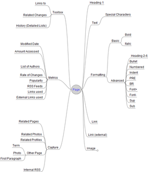
Types of Widget Formatting
- Image widget - used to display an image with a caption
- Text widget - used to display a specific set of text
- Video widget - used to embed an ogg video player
- Article Widget - represents a separate page by showing a title, excerpt and an image if available
- Link widget - lists a series of links. Most cases it presents a digest of links within the current page.
- External Link widget - lists a series of external links. Used to present a set of links related to a spotlighted topic.
- RSS Widget - used to display content obtained from an RSS feed.
It's important to nail down what elements can be accessed by a widget.
Inline Objects
Content that is flow-based and is anchored to how text is displayed. Inline objects will change in location according to how text is is forced to flow. The most common form of content within the wiki format.
Types of Inline Objects
- text
- links
- external links
- Images
- Galleries
- Table of Contents
Change Tools
The Change tools are actions used to activate the editor for a page or a specific page.
Types of Change Tools
- Edit Page (seen in the upper right tab)
- Edit Section (seen as an Edit link within each heading 2 section
Though Wikipedia has continued to have the Edit Page tool as a tab in the upper right, their commercial division, Wikia has started using a button located by the page title to do the same thing.
Property Tools
Tools used to identify properties of a page that is tracked by the wiki system.
Types of Property tools include
- What Links here
- Related changes
- View History
Editor (OUT OF SCOPE)
The Editor as of April 2011, is out of scope for the redesign, but is listed here anyways.
Seems pretty close to Wikipedia's Editor
The editor is an embedded content submission area that is used to add, update, or change existing content. The editor provides text that is integrated with wiki markup. A graphic button toolbar is provided that will insert wikimarkup to text. An advanced form of the toolbar is available. There has been some discussion for using a different Editor.
|
Basic formatting
Advanced formatting
|
Advanced Insert
Special Characters (with font mapping)
|
Though I'm hard pressed to get into the conversation about the footer, it tends to be addressed when discussing the header. There has been a lot of evolution lately about the footer element. Just what is in there now has grown.
It's always had boiler plate stuff like Policy, Contacts, Copyrights. There are also new items that have not been warranted in the footer. I think people have realized that there is still a large percent of people who arrive at the bottom of the page, who still haven't found the content they are looking for.
Patterns
-
Footer navigation of Dell Computers
-
Footer navigation for WikiFashion
-
Footer navigation for Valtera
The idea with these more complex footers is to act as a spring board to send a user to a better topic instead of requiring the to scroll back up to find something interesting.
Wireframes
-
Footer Idea #1 Wireframe
Visual Design "Dark Rose"
-
Footer Idea #2 Wireframe


